Ethereum

Ethereum Rainbow Chart March 2024 Update and How to Read It?
Posted:
| Last updated: March 19th, 2024
contributor

Confused by the ever-changing price of Ethereum (ETH)? The Ethereum Rainbow Chart can be your guide! In 2024, this chart has become an essential tool for both novice and seasoned investors navigating the volatile landscapes of cryptocurrency markets.
Through this update, we delve into the nuances of the Ethereum Rainbow Chart, offering a step-by-step guide on interpreting its colors and patterns. Moreover, we will uncover where Ethereum stands on this chart as of March 2024.
What is the Ethereum Rainbow Chart?
The Ethereum Rainbow Chart is a vibrant visualization tool designed for long-term predictions of Ethereum’s price movements. Inspired by the Bitcoin (BTC) Rainbow Chart, it combines a logarithmic growth curve with color bands to easily depict Ethereum’s different market sentiments and valuation phases.
This approach facilitates the observation of exponential growth in cryptocurrency values, which might not be as perceptible on a standard linear scale.
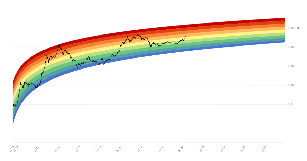
Ethereum Rainbow Chart explained – Image via CoinStats
The working of a Rainbow Chart
- Logarithmic scale: The chart uses a logarithmic scale, which shows proportional relationships in the data rather than absolute changes. This is useful for assets like Ethereum that can experience rapid price increases.
- Color bands: Each color band represents a different market condition, from “buy” zones to “sell” zones. The colors can also be seen as sentiment indicators, from fear at the bottom to greed at the top. The idea is to counteract emotional investment decisions by providing a visual cue.
- Dynamic adjustments: Lastly, the chart adjusts as new price data becomes available, potentially shifting the regression model and the positions of the color zones.
Beginner’s guide to reading the Ethereum Rainbow Chart
If you’re struggling to interpret Rainbow Charts, here’s a general guide to help you navigate it:
1. Dark red zone (maximum bubble territory)
This extreme area signals that the asset is highly overvalued, and the risk of a significant correction or crash is elevated. Selling and taking profits in this zone could be wise to protect against potential losses.
2. Red zone (overbought)
The red zone suggests that Ethereum is in an overbought condition. This means that the price has been pushed to levels that may not be sustainable in the near term.
In traditional market analysis, an overbought condition is often followed by a price correction as traders start taking profits, leading to an increased supply of ETH for sale.
3. Dark orange zone (FOMO building up)
In the dark orange zone, buyers are dominating the market, and a sense of fear of missing out (FOMO) is building up. This indicates an intense buying pressure where new investors are entering the market.
While this can lead to short-term price surges, it also increases the risk of a sudden market correction if sentiment changes or early investors start cashing out.
4. Light orange zone (balanced market)
The light orange zone suggests that the forces of supply and demand are relatively even, leading to more stable prices. In a balanced market, neither buyers nor sellers have clear dominance, and the price of Ethereum moves within a more predictable range.
This stability can be seen as an opportune time for investors to reassess their positions without the pressure of extreme volatility. It might also indicate a period of consolidation before the next significant price movement.
5. Yellow zone (hold)
The yellow zone implies that while there might not be strong signals to buy more ETH or to sell existing holdings, maintaining one’s position could be advantageous in the long run.
It’s a watchful wait stance, where investors keep a close eye on market developments without making immediate, drastic changes to their portfolios.

Ethereum Rainbow Chart colors – Image via Pixabay
6. Light green (still cheap)
In the Ethereum Rainbow Chart, the light green zone signifies a phase where ETH is considered relatively cheap. This zone indicates that the price is lower than the historical average, potentially offering investors a favorable entry point before an anticipated increase in value.
7. Green zone (buy)
Often considered the “ideal” zone, the green band suggests that Ethereum is fairly valued. Prices in this range are thought to offer a good balance of risk and reward for long-term investors. Buying during the green phase is often recommended for those looking to accumulate Ethereum for the long haul.
8. Blue zone (undervalued)
As prices move down into the blue zone, Ethereum is considered undervalued. This zone suggests that market sentiment may be overly bearish, and prices could represent a significant discount.
9. Dark blue zone (basically a fire sale)
The bottommost bands signal that Ethereum is significantly undervalued, resembling a “fire sale” with meager prices. They present the best buying opportunity, offering the potential for substantial long-term gains as the market recovers.
Ethereum Rainbow Chart: March 2024
In March 2024, ETH lies in a light orange zone. This suggests a balanced market. So, the decision to buy, sell, or hold depends on an investor’s strategy, risk tolerance, and investment horizon.
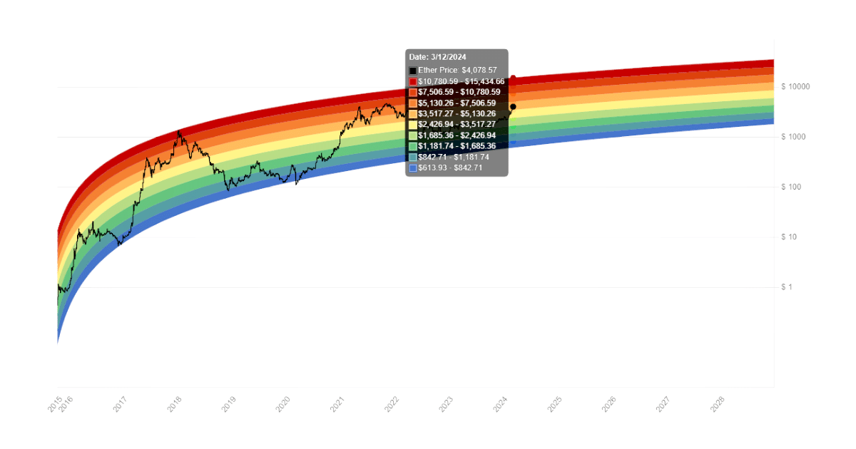
Analysis of Ethereum’s investment potential – Image via CoinStats
Here’s a breakdown of considerations for each action:
Buy ETH
- Long-term perspective: If you have a long-term investment horizon and believe in the fundamental value and future growth of Ethereum, buying during a balanced market could be a strategic move.
- Dollar-cost averaging (DCA): This period might be ideal for implementing or continuing a DCA strategy. Here, you invest a fixed amount regularly, regardless of the market condition. This approach can help mitigate volatility and lower the average purchase price over time.
Sell ETH
- Profit-taking: If you have already achieved significant gains and the market’s balanced state meets your target sell conditions, it might be an opportune time to realize some profits. This is particularly relevant if you anticipate increased volatility or have short-term investment goals.
- Portfolio rebalancing: The balanced market condition could be a good opportunity for portfolio rebalancing. If Ethereum’s recent performance has skewed your investment portfolio away from your desired asset allocation, selling a portion of your ETH holdings to rebalance your portfolio can help manage risk.
Hold ETH
- Wait-and-see approach: In a balanced market, holding can be a wise choice, especially if you are unsure about the market’s direction. This strategy is suitable for investors who are not affected by short-term fluctuations.
- Stability: If your analysis suggests that the market is likely to remain stable or improve, holding your position allows you to avoid potential transaction costs and taxes associated with selling, and you remain positioned to benefit from future growth.
Decision factors
- Market analysis: Continuously monitor the market for any new trends or data that might affect Ethereum’s price. Use a combination of technical, fundamental, and sentiment analysis.
- Risk tolerance: Assess your risk tolerance. If potential short-term market downturns lead to uncomfortable stress levels or financial strain, adjusting your position might be prudent.
- Investment goals: Align your actions with your investment goals. Whether you’re investing for long-term growth, income, or speculation, let your goals guide your decision-making process.
Ethereum Rainbow Chart Use-Cases for Investors
When considering investing in Ethereum, the Ethereum Rainbow Chart can be incredibly helpful. It provides insight into past price movements and potential future directions.
By analyzing different colored price ranges over time, investors can identify opportune moments to enter or exit positions. Essentially, the chart highlights areas where significant buying or selling activity is likely to occur, aiding decision-making processes regarding Ethereum investments.
Limitations of Rainbow Charts
Like any analytical tool, the Ethereum Rainbow Chart has its limitations. Here are some of the key limitations to consider:
- Historical data dependency: The Rainbow Chart relies heavily on past performance, which may not necessarily predict future price movements accurately.
- Subjectivity in color zones: The interpretation of color zones can be subjective. This can potentially lead to differing opinions on market conditions.
- Lack of fundamental analysis: It does not incorporate a fundamental analysis of Ethereum’s underlying technology, adoption rates, or other developments.
- Oversimplification: The chart may also oversimplify complex market dynamics. This can lead investors to overlook external economic and regulatory factors that affect Ethereum’s price.
- Volatility underestimation: It might underestimate the inherent volatility of the cryptocurrency market, leading to overly optimistic or pessimistic investment decisions.
- No timing guidance: The chart does not guide timing, making it challenging to execute buy or sell decisions at optimal moments.
Ethereum Rainbow Chart Advantages and Disadvantages
Advantages of the Ethereum Rainbow Chart
Once you understand how the Ethereum Rainbow Chart works, let’s explore why it’s such a valuable tool:
- Accessible Understanding: This chart offers a straightforward way to comprehend market sentiments and track Ethereum (ETH) price movements. Its use of layers and colors makes it accessible, even for those new to technical analysis.
- Comparative Analysis: It serves as a valuable comparative tool, enabling users to analyze market trends and price levels across various cryptocurrencies. This comparison can provide insights into Ethereum’s performance relative to other digital assets.
- Predictive Insights: Incorporating the Ethereum Rainbow Chart into your analysis can aid in predicting future price movements based on historical market cycles. Observing patterns in price behavior can provide investors with a better understanding of potential future trends.
Disadvantages of the Ethereum Rainbow Chart
Despite its visual simplicity and utility, there are limitations to consider when using the Ethereum Rainbow Chart:
- No Guarantees: No tool, including the Ethereum Rainbow Chart, can reliably predict future prices in the highly volatile cryptocurrency market. While it may provide insights into past trends, it cannot guarantee future outcomes.
- Limited Historical Data: Unlike the Bitcoin Rainbow Chart, which extends back to 2010, the Ethereum Rainbow Chart has a more limited period. This shorter historical data may result in less accurate predictions and analyses.
- External Factors Not Considered: The chart does not account for external factors such as government regulations, economic conditions, or technological advancements. These factors can significantly impact Ethereum’s price movements but are not reflected in the rainbow chart.
- Ecosystem Changes: Changes within the Ethereum ecosystem, such as upgrades or protocol changes, are not accounted for in the rainbow chart. These developments can have substantial effects on Ethereum’s price dynamics but are not captured within the chart’s framework.
What is the difference between the Bitcoin and Ethereum Rainbow Charts?
The Ethereum Rainbow Chart and the Bitcoin Rainbow Chart differ in the price ranges they represent and their time frames. This difference is logical given Ethereum’s historically lower value compared to Bitcoin.
The Bitcoin Rainbow Chart dates back to 2010, providing a more extensive historical perspective, while the Ethereum counterpart records price performance only from 2015 onwards.
Both charts visualize historical price trends, aiding investors in identifying potential support and resistance levels. However, they should not serve as the sole basis for investment decisions, requiring additional analysis and consideration of various factors.
The takeaway
The Ethereum Rainbow Chart is a helpful indicator, but remember, it’s not a crystal ball. Cryptocurrency remains a volatile market. By understanding the Rainbow Chart’s logic and combining it with your research, you’ll be better positioned to navigate the ever-shifting world of Ethereum. So, are you ready to unlock the secrets of the Rainbow? Dive in and get charting!