Bitcoin: 3 signs that ‘we are getting ready to see’ this price movement

Although Bitcoin was heading south on the back of a 4% drop in 24 hours at press time, some charts still seemed to point to a bullish market for the cryptocurrency. These charts were discussed by popular analyst and trader Lark Davis as he shared his thoughts on Bitcoin’s price going forward and how these charts can come in handy to figure that out.
1. The Bullish Divergence
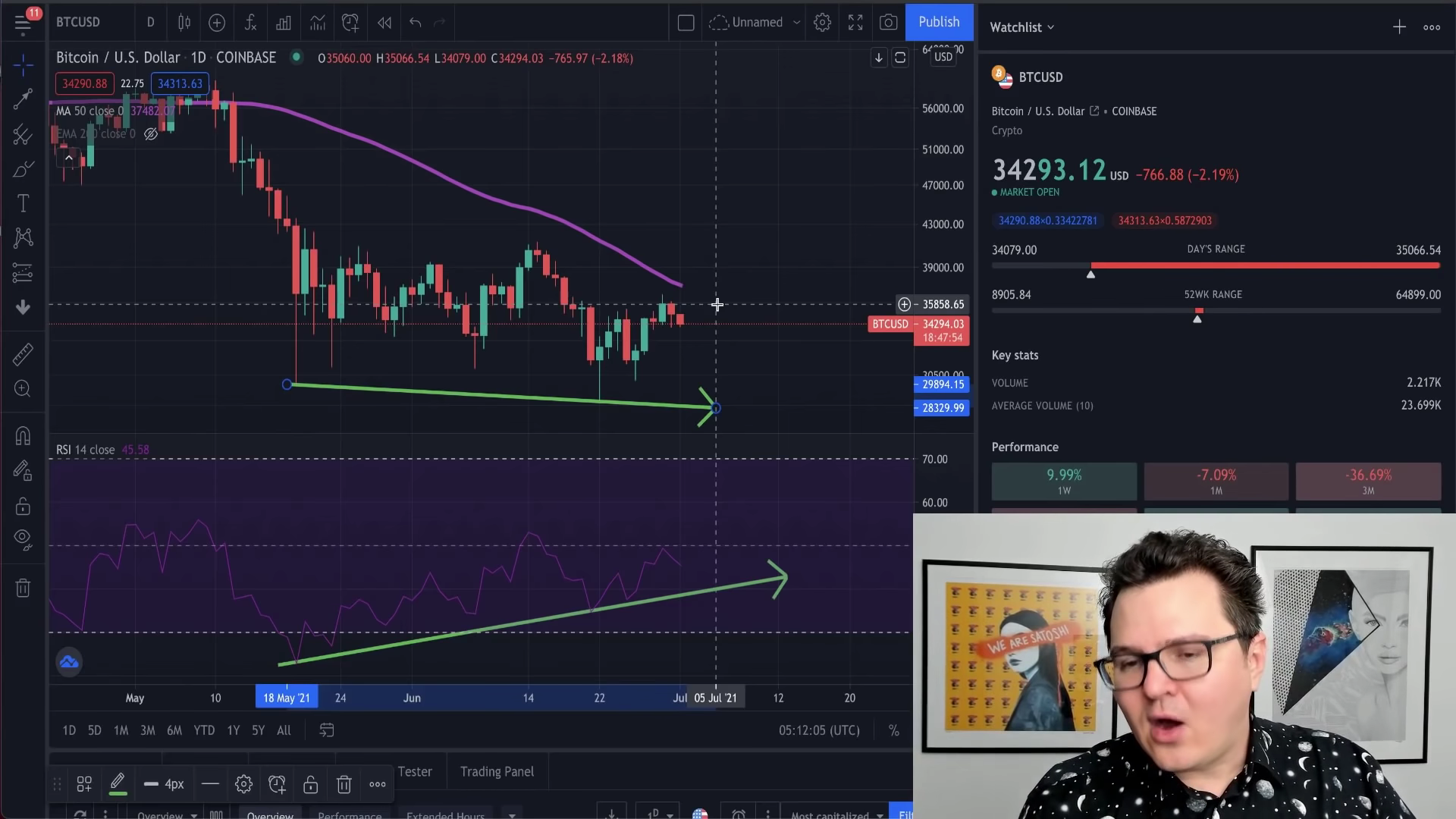
A bullish divergence is formed when the price forms a lower low while the Relative Strength Index (RSI) displays higher lows. On 19 May, when the price started falling, the RSI began rising from its oversold position and has continued to move up since then. Such contradictory findings form the bullish divergence on Bitcoin’s chart. According to Davis,
“This shows that the market is starting to build up again. This indicator could indicate that we are getting ready to see that price recovery coming in from Bitcoin”
Additionally, an important level here is the 50 Day Moving Average which would help the bullish reversal take place.

Bitcoin Bullish Divergence | Source: Lark Davis
2. Wyckoff Accumulation
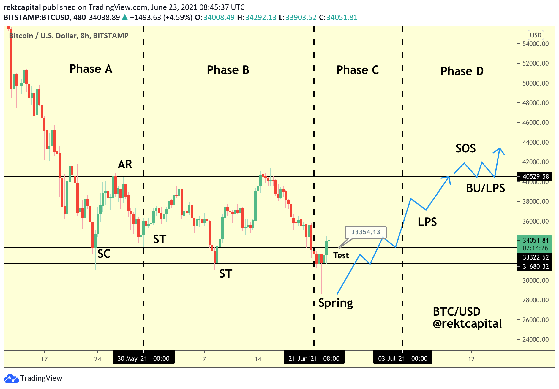
This structure has been a hot topic for a while now. While long-term analysis underlined a Wyckoff Distribution, short-term analysis was pointing towards a Wyckoff Accumulation taking place. Bitcoin has already validated Phase A and Phase B and all that remains is a simple test in the lower $30k-33k range to validate Phase C. Once this phase is cleared, a bounce-off could push BTC into Phase 4. As previously stated, such a move could help the coin reclaim the $40,000-level, sign of strength (SOS) mark and then rally ahead.

Short Term Wyckoff Accumulation | Source: Rekt Capital
3.Bull Cycle
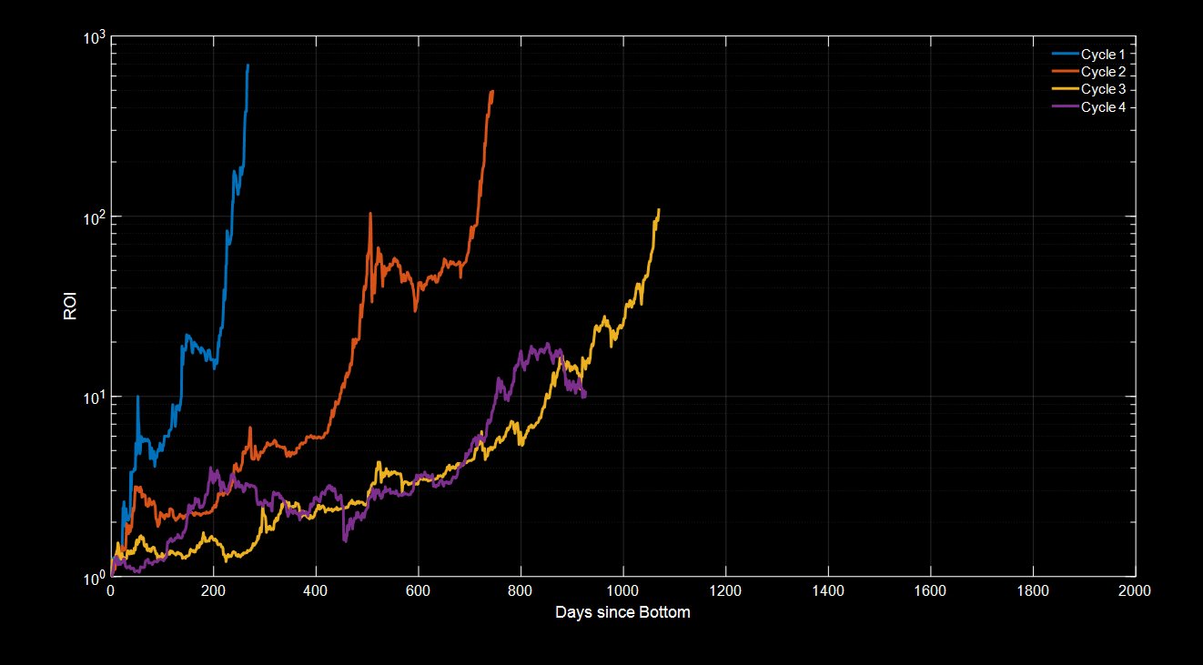
Davis’ final observation was about the past bull cycles of Bitcoin and their performances to date. The blue cycle (Cycle 1) represented the first-ever Bitcoin bull run. The orange line (Cycle 2) was the 2013 bull run, the yellow line (Cycle 3) represented the 2017 bull run. And finally, the purple line (Cycle 4) highlighted the prevailing, active bull cycle.
What’s more, a closer look seemed to suggest that while the bull cycle is getting longer, the total amount pumped is getting lower too. According to Davis,
“The current bull market has lasted for significantly less time than the 2017 bull market, which means it is highly unlikely that this bull market cycle has finishe”
For now, the coin could enter some consolidation and then eventually rise back up to place itself at the ROI levels in line with its previous bull cycles.

Bitcoin Bull Cycles | Source: Benjamin Cowen


